Showing posts with label linoleum block. Show all posts

Thursday, March 1, 2018

Waterlines installation at Works Gallery


I have a new installation up at Works Gallery in San Jose, as part of Eco Echo: Unnatural Selection. See the press release here. Here's a sneak peek! Click on the pictures for a larger view.

Sunday, February 19, 2017

Equilibrium - new artist book


While working on all my Autonomous Drying experiments this past fall, I was also working on a new artist book, which was just released this past month at the Codex Book Fair. It was funny how many artists commented at that event that Codex has become a deadline for new books.

This book is a bit more personal that anything I've worked on in a while. Titled Equilibrium, it's a tunnel book made up of some personal symbolism and story. The idea for this book came from a suggestion Enrique made to Robert while they were talking about his condition. Robert had mentioned that when he was riding his bike, his pain dissipated. Once the ride was over, it came back, and the results could not be duplicated on a stationary bike. Enrique suggested that maybe it wasn't the exercise, but the balancing.

As someone who constantly is constantly juggling work, art, home, friends, health, you name it, the idea of balance is frequently such an elusive one, and is even more complicated for those who suffer chronic pain and illness.

Interestingly enough, a gentleman came up to my table during the fair, who was coincidentally also named Robert. Without reading the colophon, he started asking me about the book, mostly regarding bike riding. As I started to explain, I came to the part where I was saying,"It's not the exercise..." in which Robert snapped his fingers and interjected before I could, "It's the balancing!"

He went on to explain that it's the same for his condition (Parkinson's), and that stationary bikes also don't have the same affect.

I'm not sure what to determine from this anecdata. The idea of balance as form of healing both literally and metaphorically is something to think about.

As for right now, I'm gearing up for the new few months. March is has some big events coming up - Book Bombs will be at the Center for Book Arts for our Keeping the Fire Alive workshop on March 4 - which, crazily enough, we proposed to do waaaay before the election. The Rhinoceros Project will be part of the 100 Days of Action and Print Public at the Kala Art Institute on March 11 from 12-4, and then traveling to the Sierra Nevada Steamroller Print Festival on April 22.

So...while all this is going on, keeping in balance is tricky, but I try.

Friday, May 20, 2016

More new prints


This series continues. I'm calling the entire series Division, named for Division Street. The series is becoming about the contrast between gentrification and impoverishment.

Sunday, November 1, 2015

New Print and collaboration about Pluto!


As a usual gap in blogging indicates, a whirlwind of activities happened. I need to sit down and really do a couple of posts about the time at Banff, but because it was just SO MUCH I need to process a bit.

So to get back into the rhythm of blogging, I'm writing today about my recently finished print for the Pluto Print Exchange that Mandy organized. Robert and I ended up collaborating on our piece, and we didn't end up killing each other! (I find it odd that as frequently as I collaborate with others - Marie, Mary, Anne - this was my first time with my husband).

With all the new images of Pluto from New Horizons, I started looking at images of Pluto from mythology, particularly in printed matter. Robert and I both ended up being drawn to this image by Hendrick Goltzius.

Our original intent was to combine the historic and the most recent scientific, perhaps in a sort of like Vitruvian Man. However, the idea developed through our love and respect for papercutting to incorporate that technique. We were also inspired by Allison Smith's Pitcher Collection, and how isolating an image from context makes it both more playful and yet gives it a certain presence.

Using some of the leftover Sekishu from my Small Plates residency (thanks SFCB!) we digitally printed (with archival inks) some images of Pluto's surface. I carved a block based on Goltzius's Pluto (above, inked) which was then printed onto the Sekishu.


The prints were then cut out of the Sekishu.


(I have to confess, the whole time I was cutting these, I kept thinking about this post from The Toast, and the line, GET THIS ARSE.)

Finally, the cut out images were chine colle'd to Rives BFK.


Click on the images for larger views.

The print needs to be properly documented, still. Next spring, the entire portfolio will be exhibited at UArts in the Printmaking Gallery. Artists from Oakland (me), Seattle, Iowa, Minneapolis, Pittsburgh, and Philadelphia participated. I've yet to see the rest of the portfolio, but have heard good things about the other pieces - trying to be patient but very excited!

Saturday, July 18, 2015

Printmakers for the Ayotzinapa 43 at the Santa Cruz Public Library


The Printmakers for the Ayotzinapa 43 portfolio is currently on display at the downtown branch of the Santa Cruz Public Library. There will be reception with a poetry reading and performance on Friday, August 7.

My print is the first on the left in the middle row. You can see a earlier post about the making of it here.

Sunday, May 31, 2015

Printmaking for Los Ayotzinapos 43


Back in March, I was invited by Stephanie Martin and Melissa West to participate in a project they were organizing called Printmakers for the Ayotzinapa 43. For this endeavor, they invited printmakers to make a print that commemorated one of the students who was a victim of the Iguala Mass Kidnapping.

Although I intellectually understood the importance of the project, I didn't realize what I had gotten involved in at first. The artists were given a list of names, and I selected Giovanni Galindes Guerrero, for no particular reason. All I knew about him was this short bio, and so, armed with this small amount of information, I began to think about how I could honor him.

My difficulty was that I had more information about how Giovanni died than about his life. I've done portraits before, but usually of people I knew and connected with. But in this case, I knew very little about his personality, his quirks, his individuality. I knew he was studying to be a teacher; I am a teacher. I knew his nickname was El Espáider (the Spider). I knew he was twenty years old at the time of his death. And I knew there had to be so much more that filled his life, that made up his soul.

Somewhere in all these perambulating thoughts, I turned to art history. The prints of Taller Grafica Popular, particularly Leopoldo Mendez, always inspire me, and felt very relevant to my subject matter. This print has always stayed with me, and became my visual guide. The most haunting part of the print is the smoke of the train, evoking the final destination of the Holocaust deportees to the cremation chambers of the concentration camps.

Giovanni's body was also burned after his death. Thinking about that, his nickname, and Leopoldo's print, I started sketching. I decided to include a spiderweb as the first layer as a reference to his nickname (see the print above), but also an allusion to interconnectedness.

The next layer was his portrait, and a layer of smoke.


This was followed by a chain of buses, like the ones the Ayotzinapa 43 were riding when they first clashed with the police.


When I'd been sketching, I'd originally thought this print would be three layers, and that when I reached this point it would be finished. However, once the imagery was printed, it didn't seem complete to me yet. Sometimes a drawing translated into print needs more. I've been a printmaker in some form or another for over fifteen years, and I still learn, again and again, to listen to the process.

So went back to sketching, and asked a few friends for their thoughts. I felt that the smoke in the print made the image unbalanced, so I added another layer.


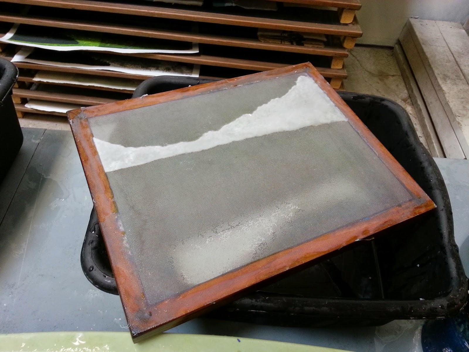
The bottom still felt empty, it needed just something a little more to send it home. With all that gray, I felt that it needed a moment of color. After some deliberation, I decided to add the number "43" using pochoir. Several of my students this semester have been experimenting with it, so I thought I'd give it a try.


The prints still need to be curated and signed, but I think the image is complete now. I hope it honors the memory of Giovanni Galindes Guerrero well.

It's been a busy spring, with finishing this print, my regular teaching, two residencies, and editioning an artist book. I'm fortunate to be a part of so many things, and trying to remember to pratice self-care during this insanity, rather than putting it off till after. However, moments like these, it's nice to step back and see the work complete.


Monday, January 12, 2015

"Living with Endangered Languages" at Root Division


2014 closed with a whirlwind, with the completion of Future Tense! Which is currently part of Living with Endangered Languages in the Information Age at Root Division, until January 31.

The opening was this past weekend, here's a bit of a sneak peak. Since I had to exhibit the book under protection, I included a video to show more of the piece.


It was also great to be a part of show with artist friends who I so greatly admire, like Pantea and Ali. (And my nametag would not stick to my dress for anything, which is why I stuck it on my arm).


I didn't get to photograph many of the other pieces in the show, but loved this piece by Irene Carvajal.


Future Tense will be debuted to the book arts community next month at the Codex International Book Fair.

Finally, a midst all this craziness, my studio was just featured on Hyperallergic!

Saturday, November 22, 2014

Bokashi Pulp Painting


Pulp painting and stencils are becoming contributors to how I make images, particularly the artist book I've been working on for the past few years, Future Tense (which is almost finished!) While making the final sheet of handmade paper for the book, I used a technique I called bokashi pulp painting.

Bokashi is a actually a term for a technique in moku hanga, known in the US sometimes as Japanese woodblock printmaking. It means a gradation of color. In homage to this technique, I have appropriated this term for a similar effect.

To achieve this effect, pulp paint is suspended in a vat of water. I don't use any formation aid for this, and I'm not sure that it would actually be helpful. The mold - without the deckle, is then dipped at a angle so that the pulp paint slides up the mold. The mold is not fully immersed, some sections remain above the surface of the water. You can see the pulp collected on the mold above.


Being pulp paint, the fibers collected in a bokashi pull are to fine to have their own integrity as paper, so they must be couched on top of base sheet - see above. Please note that the base sheet was pulled previously to pulling the bokashi pull.

It's difficult to see in the photo above, but the light blue transitions just barely, having slightly more pulp at the bottom of the paper. Also notable is the soft, watery edge of the pulp midway up the paper.

(I can't take credit for inventing this technique - back when I was TA'ing Papermaking at UArts, I remember one of my students, Danae, coming up with it, and just falling in love. So if she ever reads this - thank you!)

To contrast this delicacy, part of the print has a hard edge stencil. Below, the mold with the stencil on, and the remaining pulp after carefully peeling the stencil off.


For stencil sheets, I use foam sheets like these. Some artists use dendril or a thin vinyl material, I prefer the sturdiness of these. They also hold up great for re-use.

Below, the stencil couched on top of the bokashi pull.


The imagery didn't stop there - I continue to print on these paper. Here, after three layers of ink - two more to go! (Soooo close to finishing this book!)


Sunday, October 12, 2014

Roadworks 2014


A belated post on the San Francisco Center for the Book's Roadworks Event! For those who may be unfamiliar, this is their annual event in which they invite a few select artists to make 3'x 3' linoleum block prints. These prints are then printed by steamroller at their public event, using the street itself as a press bed, and later sold to support the center.

I met my husband at a similar event, so it's was a pretty nostalgic day for me. This year, the center used a vintage steamroller that actually ran off of coal.

I'm always impressed by how organized the event is - teams of orange-shirt clad volunteers are divided into "clean hands" and "inky hands," so one team lays down and collects the block, while a another lays down the paper and pulls the print.


The event is also a street fair, with artists and organizations peddling their wares, and opportunities for people to try their hand at art activities, such as block carving, or papermaking! Papermaking was offered by the Mobile Mill, and it was my first time seeing it in action.


I was particularly impressed with the organization of the mill - storage for molds and deckles and pellon built right into the beater table. Although part of me questions the carbon footprint of a traveling workshop in this day and age, I think it's still pretty exciting, and anything that spreads the papermaking gospel has merit.

If you want to support the San Francisco Center for the Book by purchasing one of the prints, please visit here. You can also explore their website of which offers all sorts of classes, exhibitions and events.

Thursday, June 19, 2014

Work continues


Above, I finally organized the beater corner of the studio. Efficiently using the wall space around Dulcinea, check! Below, papermaking viewed from the loft.


Work continues on Future Tense.


So far, invasive plants that have been used are French broom (Genista monspessulana), pampas grass (Cortaderia jubata) and ice plant (Carpobrotus chilensis).

In addition to making the paper, printing continues.


I am enchanted by the fibers of the handmade paper viewed through the negative spaces in the printed image.

When I started this artist book, which technically was years ago, finishing seemed a faraway, near impossible task. Yet lately, it seems to be rolling along, and I am excited by the progression.