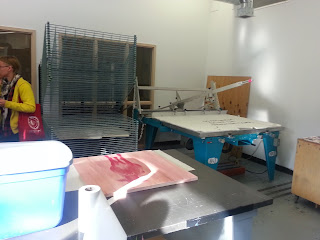
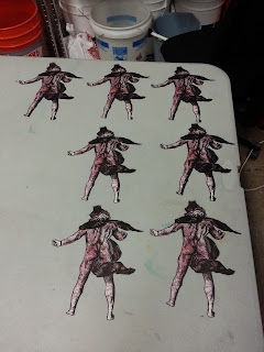
I have a new installation up at Works Gallery in San Jose, as part of Eco Echo: Unnatural Selection. See the press release here. Here's a sneak peek! Click on the pictures for a larger view.
Showing posts with label printmaking. Show all posts
Showing posts with label printmaking. Show all posts
Thursday, March 1, 2018
Waterlines installation at Works Gallery
I have a new installation up at Works Gallery in San Jose, as part of Eco Echo: Unnatural Selection. See the press release here. Here's a sneak peek! Click on the pictures for a larger view.
Sunday, June 26, 2016
The Weekend Paper
The title of this post is a nod to Helen Hiebert's Sunday Paper posts, which are of course a nod to printed newspaper traditions. With the closing of my school year and two solo shows and some fall projects coming up (stay tuned!), I've been metaphorically juggling and spinning plates and walking a tightrope all at once, so, as usual, this post is a bit belated.
The first weekend of June was the opening at E.M. Wolfman for Sub Set, a collective of papermakers Rebecca Redman, Hope Amico, Alyssa Casey, and Elizabeth Boyne.
Sub Set has been working collaboratively, getting together as a group and trading materials and unfinished projects, exchanging them between as a collective "what if?" On the night of the opening, I recall asking one of the artists who made one of the pieces, and the answer was that someone made the paper and then another person drew on it and then another person....etc. To be more clear, authorship of the show was a collaborative whole.
Which gave the show an incredible energy. The artists are exploring the concept of workmanship of risk, the only limitations are the materials they had in front of them at the time. As someone who collaborates frequently myself, I can see how these experiments are opening these artists up and building a momentum for future possibilities.
The artists will be running a fundraising campaign later this year to raise money to purchase a Hollander beater - stayed tuned to their website to find out how you can contribute.
The following day was one of the ProArts Open Studios weekends, and I swung by Julia Goodman's to see some of her new large cast paper works in person.
(That's the floor in the bottom right corner of the photo above; these pieces are about five feet tall).
These pieces are rugged and topographical; she allows snippets of the bed sheets and clothing she uses to appear as reminders of her origin material. All her colors are from the clothing she uses, no added pigment or dyes.
Some of them, particularly her smaller pieces like this one, are almost a cross between pulp painting and casting.
I couldn't help thinking how Julia references the origins of her materials. They feel intimately connected to the earth, via the plants that grew her fibers, the soil that nourished the plants. Recently I've been told that the Bay Area has an enormous amount of waste clothing choking our landfills, with the additions of nylon and other petroleum-based fibers into our wearables, they aren't breaking down like they will if they were solely natural materials. Julia's work interrupts this cycle, turning waste fiber into art.
Some of her beet papyrus pieces were also on display:
Reflecting on these two exhibitions, first and foremost, I'm excited by the directions my papermaking community is exploring. Further, I was also struck by how much of what my fellow papermakers do is informed by community and collaboration (Sub Set, Julia's work with Creative Explored), and how coming together with others is such a catalytic force in this medium. The same fibers that make up paper also bring papermakers, new ideas, and new energies together.
Friday, May 20, 2016
More new prints
This series continues. I'm calling the entire series Division, named for Division Street. The series is becoming about the contrast between gentrification and impoverishment.
Friday, May 6, 2016
Monday, April 18, 2016
Pigeons!
Some new pieces recently completed. Woodcuts on Sekishu, chine colle'd onto found wallpaper. Click on the images for enlarged view. Inspired in part by my recent pieces for NIAD.
To see some of the making of these prints, check out my Instagram page.
Saturday, December 26, 2015
Banff Recollections
I've been enjoying my holiday break, catching up on some studio projects and starting a few new ones. The piece above is an in-process shot of the center panel of a print triptych I'm working on, based on my experience at Banff for the Dard Hunter Conference. The final piece will be a series of reduction linoleum blocks on handmade paper with pulp paint - the blue in the image above is actually a pulp paint stencil.
As the print progresses, I find myself remembering not only the mountains there, but the studios as well, and the integration between inside and outside as an artist's space.
All the studios at Banff either have skylights or large windows that look out towards the mountains. Even the studios for individual artists. It was so bright that the view from the windows in this pictures is overexposed, but the mountains are there.
The print shop is divided into multiple rooms. Below, the screen print area:
The screen print area is part of a long room that also houses the etching area, divided by some enclosed rooms for screen exposure and for acid. Along one side are windows that bring the light and mountains in.
I loved this guide to their ink colors:
A door in the etching area leads to the litho room:
Passing through the litho room leads to letterpress:
Next to letterpress is a clean room that can serve as a bindery or print curating space, which I neglected to photograph. Off of that room is the digital printshop - please excuse the slight blurriness.
The paper studio is in the basement. Radha Pandey was doing an Islamic papermaking demo during the tour, I'll dedicate a post to that soon.
The beater room.
The studio building is built into the side of the mountain. In the paper studio, there is still one wall of windows, but on the other side of the room, the mountain literally comes into the studio.
Raw fibers, half stuff, linters, and odds and ends on the wall of the paper studio:
The print and paper studios are coordinated by Wendy Tokaryk, whose work I was fortunate to see while in Banff.
This is just the studios I saw. The entire three days was so full of energy and revelation, it would be too long a post, so I will have to share the rest in other posts.
Sunday, November 1, 2015
New Print and collaboration about Pluto!
As a usual gap in blogging indicates, a whirlwind of activities happened. I need to sit down and really do a couple of posts about the time at Banff, but because it was just SO MUCH I need to process a bit.
So to get back into the rhythm of blogging, I'm writing today about my recently finished print for the Pluto Print Exchange that Mandy organized. Robert and I ended up collaborating on our piece, and we didn't end up killing each other! (I find it odd that as frequently as I collaborate with others - Marie, Mary, Anne - this was my first time with my husband).
With all the new images of Pluto from New Horizons, I started looking at images of Pluto from mythology, particularly in printed matter. Robert and I both ended up being drawn to this image by Hendrick Goltzius.
Our original intent was to combine the historic and the most recent scientific, perhaps in a sort of like Vitruvian Man. However, the idea developed through our love and respect for papercutting to incorporate that technique. We were also inspired by Allison Smith's Pitcher Collection, and how isolating an image from context makes it both more playful and yet gives it a certain presence.
Using some of the leftover Sekishu from my Small Plates residency (thanks SFCB!) we digitally printed (with archival inks) some images of Pluto's surface. I carved a block based on Goltzius's Pluto (above, inked) which was then printed onto the Sekishu.
The prints were then cut out of the Sekishu.
(I have to confess, the whole time I was cutting these, I kept thinking about this post from The Toast, and the line, GET THIS ARSE.)
Finally, the cut out images were chine colle'd to Rives BFK.
Click on the images for larger views.
The print needs to be properly documented, still. Next spring, the entire portfolio will be exhibited at UArts in the Printmaking Gallery. Artists from Oakland (me), Seattle, Iowa, Minneapolis, Pittsburgh, and Philadelphia participated. I've yet to see the rest of the portfolio, but have heard good things about the other pieces - trying to be patient but very excited!
Thursday, August 6, 2015
The Last Color, a new artist book
Finally some good documentation of my Small Plate book, The Last Color. This book was inspired by my interest in the history of color, particularly by listening to this. For larger pictures, just click on the images.
Due to the brevity of the residency, I didn't have time to make the paper. So I decided to pass on the good fortune, and support other papermakers. The book includes Sekishu Washi and Multi-dipped Indigo Cave Paper. The imagery was printed from two-color reduction woodblocks.
The book is a variation on the flag book structure invented by Hedi Kyle. In the front of the book is a short pamphlet with the text, printed in Garamond from hand-set type.
To purchase a copy, contact Malgosia Kostecka, Program Coordinator for the San Francisco Center for the Book, at (415)-565-0545, or visit the center. Copies are also available from Mrs. Dalloway's Bookstore at 2904 College Avenue in Berkeley, or by calling them at 510-704-8222. And if those don't work, a small number are available from me directly, shoot me at email at michelle(at)michellewilsonprojects(dot)com to inquire.
My book, along with the other Small Plates editions, is currently on display at the Center in one of their beautiful new display cases!
Subscribe to:
Posts (Atom)


